Designing a tracking & assessment tool for Rental Scooters
Organisation
Bounce
Timeline
Dec 2020 – Feb 2021
Team
Priyatham Dharmana and Nirvan Byotra (Design), Meghna Kayam (Product), Sahaj Kotha (Engineering), Murtuza Ali and Anshita Agarwal (Iconography)
Contribution
User Research, Prototyping, Visual Designs, Usability Testing
Organisation
Bounce
Timeline
Dec 2020 – Feb 2021
Team
Priyatham Dharmana and Nirvan Byotra (Design), Meghna Kayam (Product), Sahaj Kotha (Engineering), Murtuza Ali and Anshita Agarwal (Iconography)
Contribution
User Research, Prototyping, Visual Designs, Usability Testing
In late 2020, the Ops Design team at Bounce was tasked with designing a tool that helps our operations team to efficiently track and assess the state of our scooters.
Bounce is a mobility startup in India that provides scooters (locally called bikes) throughout the operating area of certain cities. Customers can book a scooter near them through the mobile app and drop it at their destination.
To make scooters available to customers at all times, they need to be regularly serviced to either refuel or fix any issues. Ops Executives perform these Tasks on scooters and are supervised by the Ops Team Leaders.
Opportunity Statement
Enable the Ops Team Leaders to efficiently assess the state of a scooter (in order to get its issues solved) when they are notified via Alerts.
User Research
Since the proposed tool should improve the efficiency, we interviewed 7 Team Leaders to understand the use cases and their current processes. Below are the findings –
Team Leaders monitor Alerts in the Control Center dashboard (an internal tool) to get notified about scooters that need their attention.
Their prominent uses cases are to
Find the root cause of any recurring issues (Tasks) on a scooter. This is to identify if it has to be moved to the warehouse for a thorough service and to evaluate the previous Executive's work.
Provide alternative locations where an Ops Executive could find the scooter that they need to attend to. This happens more frequently than we expect as GPS signals are not reliable at all times.
Analyse a scooter's trail and history to help secure it, when it is marked as 'Not Found' by multiple executives. This could be a result of theft, vandalism, or GPS issues.
Help with some miscellaneous tasks. For example, to help customers recover forgotten belongings from a scooter's trunk.
The Team Leaders then access the required information like Bookings, Location history, Tasks, and Ops Executives' actions from different tools and dashboards. They often scan through swarms of data in different tools to identify the relevant data points, and then manually join and transform them (in Google Sheets) to make sense of the events.
Screenshot of an Ops Team Leader's browser during a user interview
In almost all the scenarios, the end action for the Team Leaders is to directly communicate with either Ops Executives, Managers, or Customers.
Objective
From these findings, we observed that Ops Team Leaders spend a lot of time and efforts in finding and making sense of the required information as they have to be manually tallied from multiple sources.
This has led us to the following Job-to-be-done for the Team Leaders –
Let Ops Team Leaders see the events and info related to a scooter (which was brought to their attention via Alerts), so that they can assess its state and get its issues solved.
Information Architecture
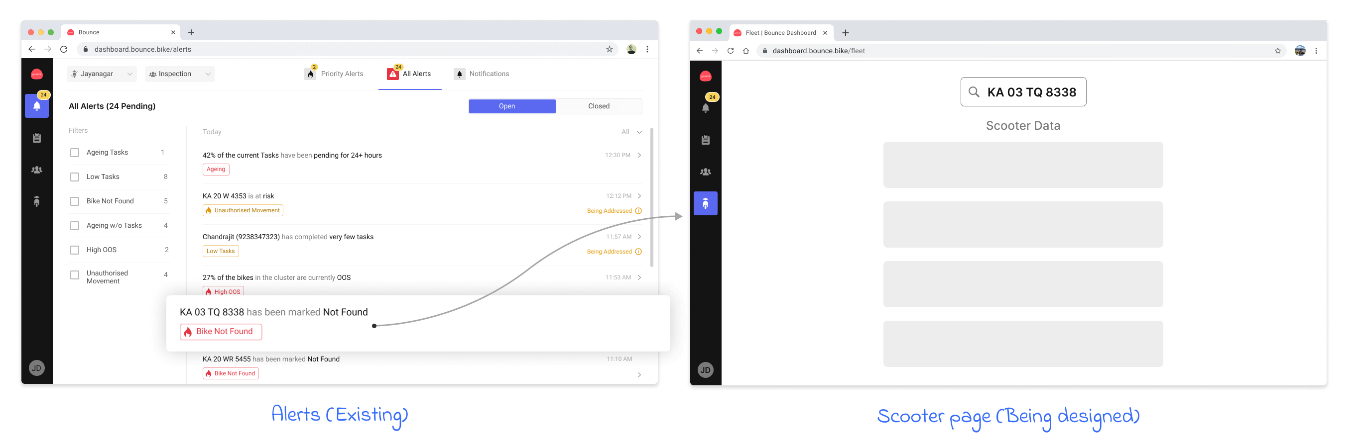
To build on top of the current processes, we added this proposed scooter page in the Control Centre Dashboard.
Since Team Leaders already use Control Centre to monitor Alerts, and manage Tasks and Executives, we could provide a seamless experience by making scooter number plates clickable and leading them to the respective scooter pages.
This new scooters page will provide the below 3 components for each specific scooter.
Identity – Unique identifiers that distinguish scooters
Interactions – Touch points of the scooter with Customers, Ops Executives, and the system
Attributes – Metadata of the scooter that may get updated during Interactions
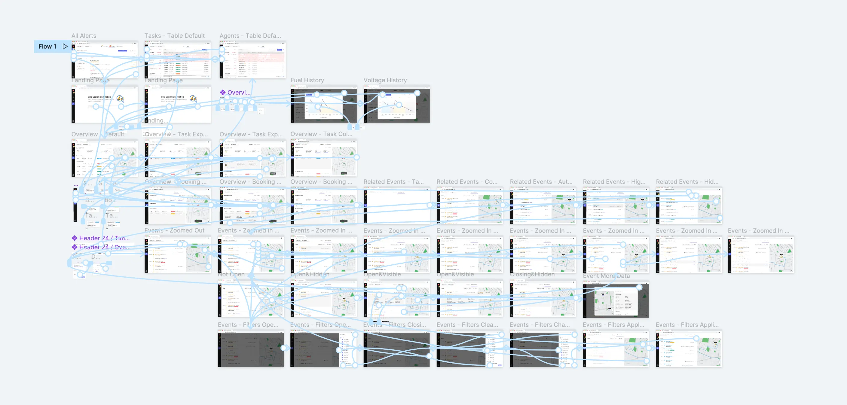
Prototyping
Since the Alerts page already exists, we spent our efforts in ideating and iterating over the Scooter page.
As a scooter's Identity and Attributes represent its current state, we placed them at the top of the page. The scooter's Events (Interactions) are placed below them. To evaluate which layout structure best suits the Events, we tried 3 different options.
Option 1 – Calendar View
The initial approach we tried was to use a calendar format to display the Events.
GPS Locations All scooters have two GPS modules transmitting their GPS coordinate at specific time intervals. While these are known as Primary and Secondary Locations, some auxiliary batteries that power these sensors also transmit the battery's own coordinates separately. For every Event that happens on the scooter, the system picks the most reliable location from the latest of these 3 coordinates. These distinct coordinates can also be individually helpful in providing potential locations where a missing scooter could be recovered.
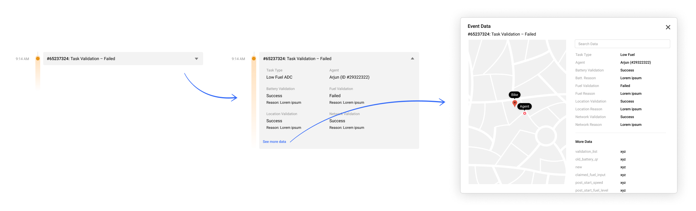
Events Data In addition to the event name, the data belonging to each event is displayed inside a modal when the "See Data" button is clicked.
Even though this first approach uses a common design paradigm, we weren't happy with the inefficient utilisation of space in the calendar.
Hover to play
Since scooters can spend a significant amount of time in an Idle state (with barely any Events happening), the calendar might look predominantly empty and would require the users to scroll way more.
Option 2 – Grouped Events
To make Events related to the same Task or Booking feel more congruous, we tried grouping events related to the same task/booking into accordions.
Despite offering a better understanding of the scooter's activities (tasks/bookings), this approach could be sub-optimal in the expanded state due to some hardware events that are regularly sent by the scooter's sensors.
These sensor events are not related to any task/booking but occur frequently when the scooter is in a booking or task. This may lead them to undermine the task/booking's own events if the sensor events are not grouped further inside the accordion.
To avoid creating another accordion for these sensor events inside the current accordion, we tried the next option.
Option 3 – List
We ungrouped the task/booking related events from the previous wireframe and instead grouped the sensor events.
The color-coded timeline helps achieve some congruity even without grouping the task/booking events.
This option has also enabled us to progressively disclose the events' data points. We did this by making each individual event an accordion, and displayed some important data points related to it.
Preliminary Validation
Since the target audience for this feature are internal employees of the company, it was easy for us to validate the solution early on with wireframes.
We've tested the Figma prototype with 7 participants and observed the following –
5 of 7 the participants were confused when they selected 'Show All Latest Locations' to view the latest primary, secondary, and battery locations on the map. This is because the latest secondary and battery locations could be present at a historical point on the scooter's route as they are not recorded as frequently as the primary location
It also came up that Locations, Parking images (clicked by the Customer/Executive at the end of a Booking/Task) and Contact Info are the most important things that they look for in Bookings and Tasks. This is because scooter safety is the utmost priority for Team Leaders.
3 of the 7 participants missed that the sensor pings are grouped into accordions and can be viewed by clicking on the label or the expand icon.
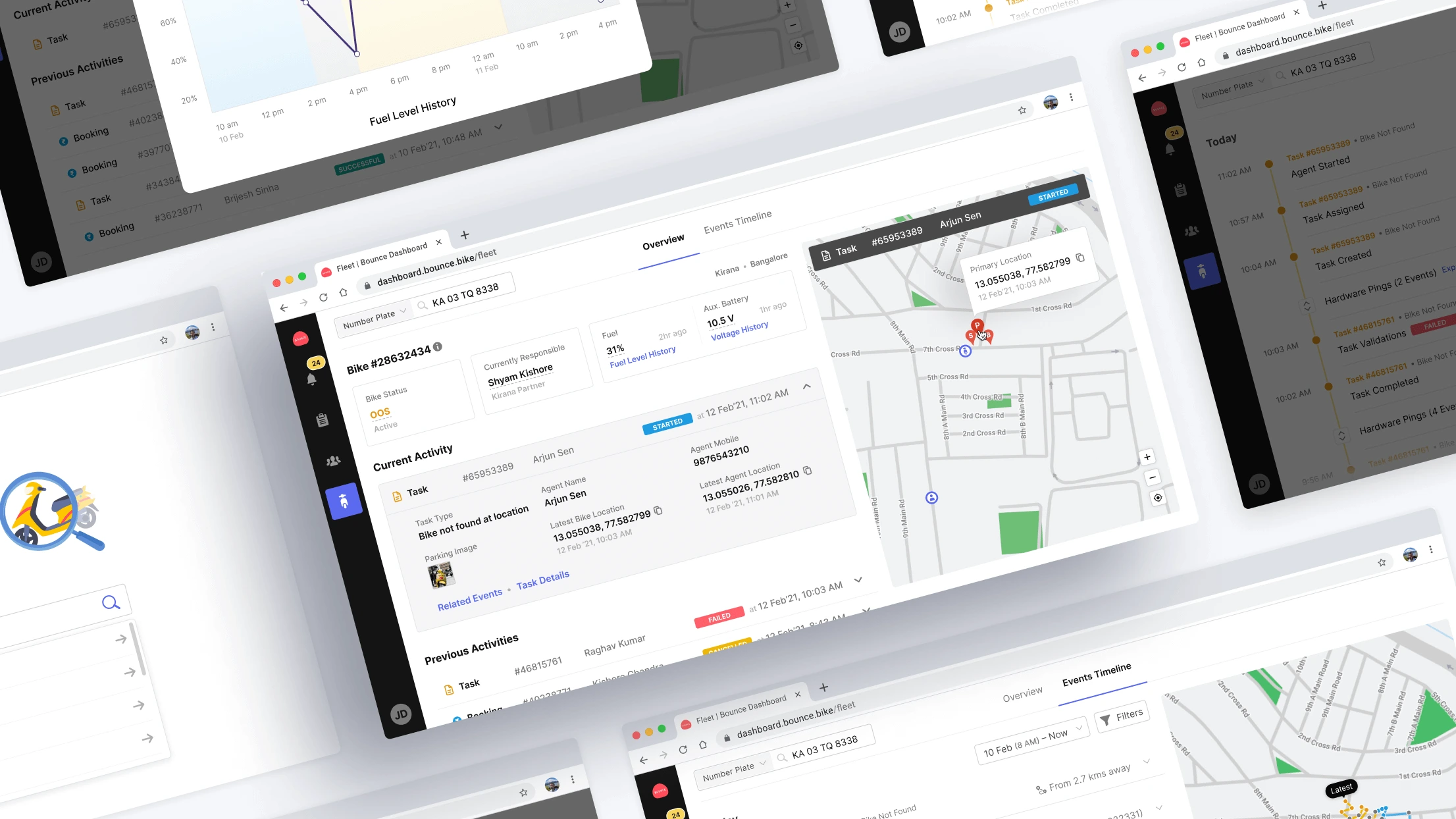
Visual Designs
To address the issues from Points 1 & 2 above, we decided to split the page into two tabs.
Tab 1 – Overview
The first tab will serve as the scooter's overview by providing only its Latest Locations and recent Bookings & Tasks. We also made the important information (like Parking images, Location of Customer/Executive at the end of the Booking/Task, their contact information) easily discoverable by displaying them along with the activities.
Hover to play
Tab 2 – Events Timeline
The second tab will display a timeline of the Events along with their historical locations. This tab will provide a more granular view of the scooter's Bookings and Tasks for in-depth analysis.
Hover to play
Map Interactions
Hover to play
Filtering Events We also gave the ability to filter the Events timeline based on the type of events. The excluded Events are hidden from the list and map, while keeping the scooter's route on the map intact.
Hover to play
There could be cases where a Team Leader might just want to jump to some specific events without having to filter others out. To allow this in a minimum viable way for V1, we introduced a "Related Events" button in the Activities' accordions.
Usability Testing
We turned the above Visual Designs into a prototype and evaluated it using the RITE (Rapid Iterative Testing & Evaluation) method with 6 new participants.
2 out of 6 participants missed the Activity-end locations of the Executive/Customer and the scooter in the Overview tab's map. This was solved (and validated) by adding some visual emphasis to these icons. (Check the clip in 2nd point)
3 out of 6 participants couldn't identify that the Activity-end locations change based on the Activity that is expanded. To improve this, we made the Activity label bigger and made it harder to miss by adding more information to it.
Hover to play
Participants took considerably long time in discerning Bookings and Tasks in the Activites list. To improve this, we added color-coded icons for Bookings and Tasks.
2 participants were surprised with the sudden page transition when they had clicked on "Related Events" inside an Activity's accordion. To ease this interaction, we added a popup (that shows up the first few times) to help users learn how they can get back to their previous view.
Since this tool is meant to make data access more efficient, validating its success requires offline actions to happen within the system so that the impact can be measured. In the absence of this data, we validated this tool's impact using qualitative feedback.


 View Figma Prototype